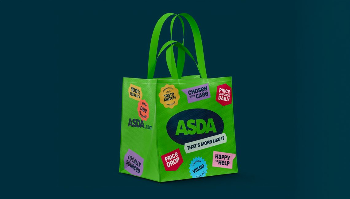
UK supermarket Asda has rolled out a rebrand courtesy of its advertising agency Havas London, who won the creative account for the retailer two years ago. The focus is on creating a more personable experience that unifies a brand that has become steadily “fragmented” as Asda has evolved, says Havas creative partner Nathalie Gordon. Asda is now a dual-colour brand, with adjustments made to that original primary green, and some graphic introductions like modern-day grocery stickers.

The redesign is at its most unique in typography, designed with Colophon. A prime example being the lead display font, Asda Headline, which is entirely unicase; Havas wanted to bring “some of the beautiful cursive quality of lowercase into bold cap height prominence,” says Lorenzo Fruzza, chief design officer.
To develop a typographic direction for an enterprise as mammoth as Asda, Havas launched an extensive audit and exploration, eventually deciding that two display fonts and two text (plus two styles) would suffice. “Asda has so much personality, we needed to create a face that would deliver that tone everywhere,” says Lorenzo. “Even in the spaces where the brand needs to be deeply functional and accessible.”