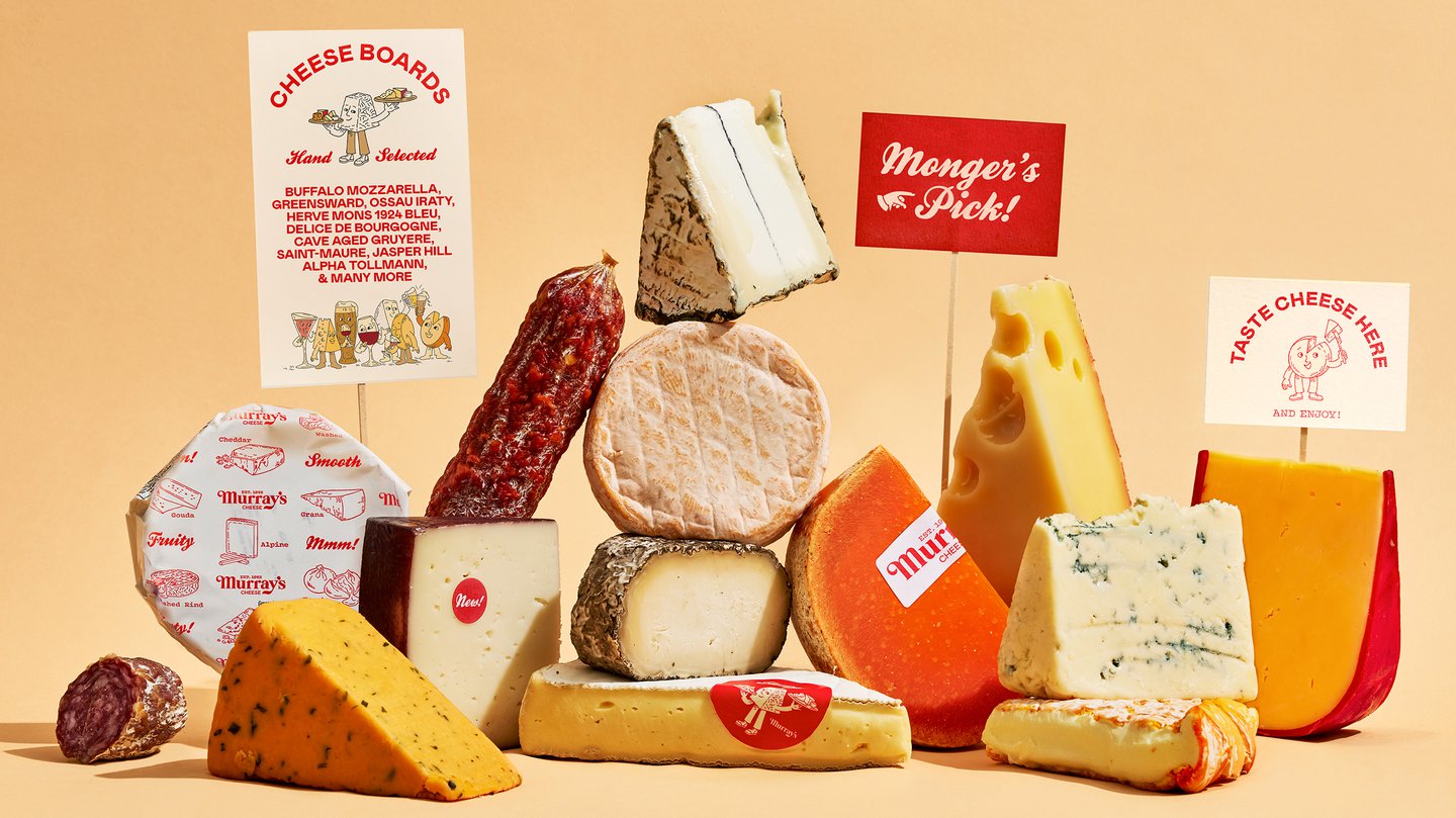
The signature colour of Murray’s Cheese is a good example of how this was done on a micro level. It was crucial the red be retained for customer recognition, but soft creamy secondary colours, drawing from the hues found in cheese, have been introduced to suggest evolution. “It even calls to mind a rich, waxy red rind that we see on cheeses like gouda or red leicester, paired with its pale, creamy interior tint,” says Jeffrey.
Illustrations from Christine Van Wassenhove are now used to show Murray’s offerings beyond cheese (classes, gifting, etc.) The playful illustrations meant Base could move beyond classic product photography and denote these wider brand elements in a less literal manner. The busy typographic texture, meanwhile, is inspired by the idea of pairing. Colophon’s Mabry acts as the functional sans-serif pair to Brick Pro, while Vulf Mono and Kestrel Script function as “garnishes”, as Base puts it.
The work for Murray’s Cheese first began as a website overhaul, with the local shop experience translated into e-commerce. The online shop is built to work like a guide, with features designed to help both seasoned customers and newcomers alike. The wider brand relaunch, which came later, follows the same concept; rather than solely uplifting the cheese (which, of course, is still elevated in the design), human touch has been identified as a key differentiator. It’s another example of the history of the establishment being leveraged correctly; this time, of its storied history as a local shop running out of Greenwich Village since the 60s.

