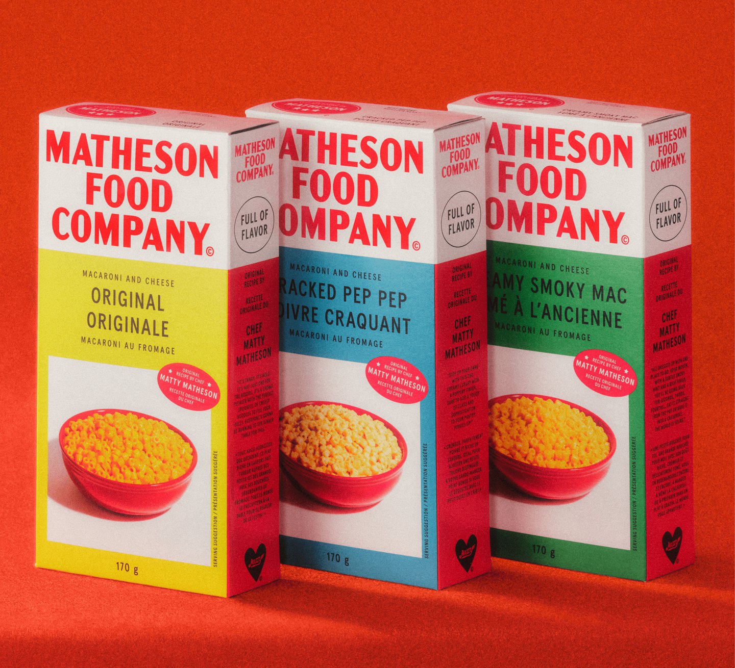
“When these products were introduced on the market in the 30s, the use of primary colours and appealing packaging was truly the start of commercialising food on shelves, even adding photography of the food on the package like a bowl of pasta,” says Justin. Today, most products have a more elaborate colour palette, making Matheson Food Company feel older and different by sticking to a back-to-basics colour palette. The same thinking is applied to packaging forms (the line is composed of traditional cans, boxes and bottles you have to give a good shake).
According to Wedge, the challenge was not to figure out how to capture a well-known personality through packaging – audiences are likely to know Matty Matheson from his work with Vice or his appearance on The Bear – but to create a heritage brand that outlives the personality. Even the name, Matheson Food Company, speaks to the brand’s desire to situate itself in food history. “Adding ‘Food Company’ adopts a vernacular you’d find on products like Hereford where ‘brand’ was literally written under the name, instead of adding a TM to the end of it,” says Justin.
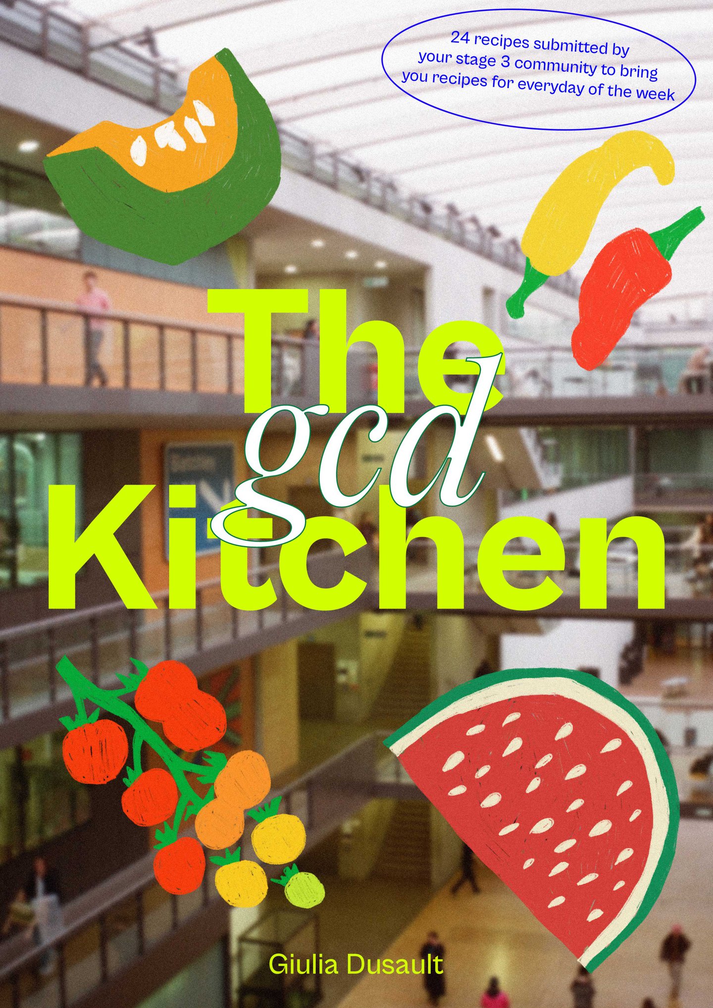
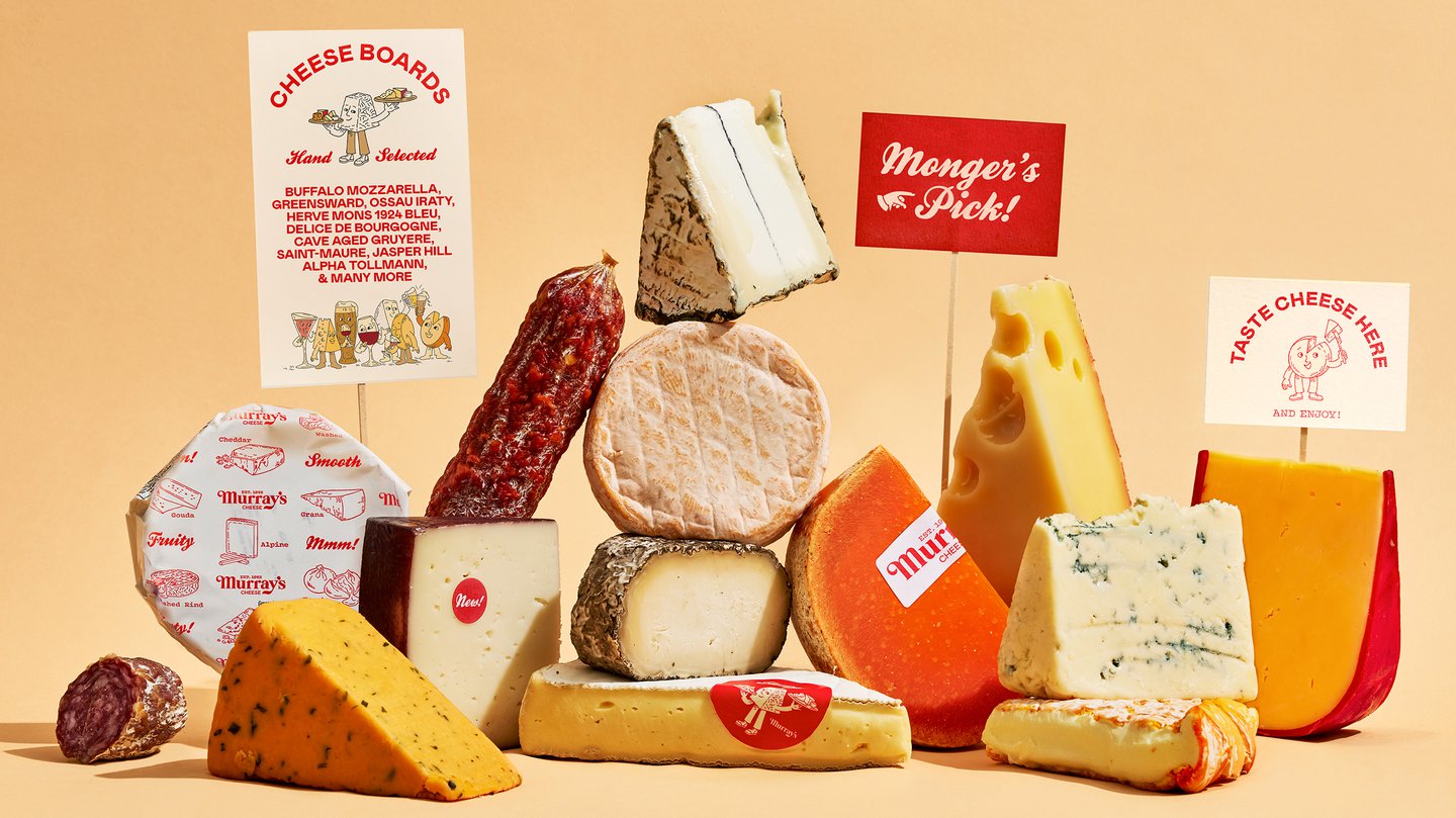
It heralds something of a change in retro graphic design, whereby brands are not just borrowing from the past to ride an aesthetic wave, but because it could foster longevity too.

