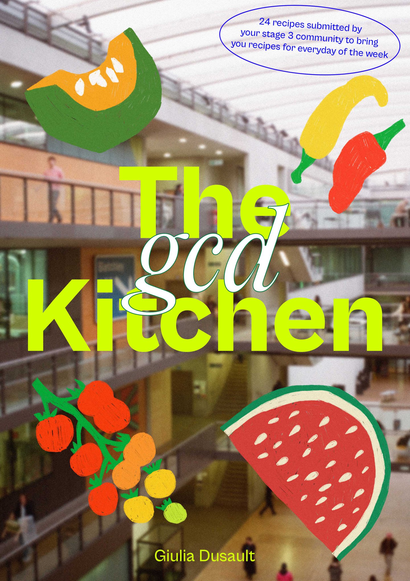
When it came to the layout, Giulia initially had each of the spreads following the same format, but she soon realised it felt a little “boring”. Instead, to ensure the spreads reflected each individual, she asked them to choose their own colour scheme, as well as a few images they wanted to include as insert pages, of their family, or of the finished meal. When even naturally compiling all of the recipes together, Giulia also realised that it felt a little “overwhelming”, so, like all good cookbooks, she decided to include a descriptive contents page, divided into four mood-based sections: Feeling inspired?, Need something comforting?, Feeling Stressed?, and Feeling Happy?. “For example, if someone is feeling stressed, they would go to this section to find a recipe that’s quick but still very nutritious and filling,” says Giulia.
Upon filing the recipes, Giulia realised how many were connected to family, and had been passed down by loved ones. Like Sashka’s recipe for Sarma, a stuffed cabbage dish passed down from her grandmother Nana who showed her how to make it before she left Bosnia, or Jacob’s “exciting” yet “affordable” pelau recipe, often made by his father. These recipes, alongside the input from contributors and non traditional format, are what gives The GCD Kitchen such a personal touch. She hopes it might inspire other young designers to experiment with the cookbook form in a way that feels unique to them, maybe even getting their friends and family involved along the way.

